Fall Wardrobe

image

Dare I say I’m ready for it?

image

I dare say I am.

image

I’ll be giving my two cents on what I think every lesbian should be wearing this fall! I’ll go more in depth and put outfits together throughout the season but here are the basics of what I’m working with.

I’ll start with the bottoms, which (surprise) are all pants. I suggest 2 in every category.

image

3 levi’s: black, dark blue, and regular blue

image

Fun pants:
Joggers
Corduroys
Biker pants

image

Various pants of fall colors

image

Jeans I’ve accumulated from the past 10 years and, in the further pile, patagonia and Columbia “adventure pants.” These piles are pants I don’t mind messing up.

Next tops. Winter and fall are great because you can wear loud tops and put a jacket over it to mute it a little. I know it’s October but it’s still tee shirt weather here so I’ve included those as well.

image

On the left short sleeve tees, next long sleeve tees, then flannels/plaids, and on the right “fun shirts.” I suggest 2 of these at least too.

image

A few solid seasonal colored shirts.

image

The first two piles are striped and spotted and patterned and solid color sweaters in no order. The pile on the right is strictly reserved for exceptionally fun sweaters. I have a ton but you honestly need just a few.

image

These are just sweats but I had to include them for good measure.

Now for the footwear:

image

Basic navy vans, my “Peter Pan boots”, tallish black boots, wine colored monk straps, grey Clark’s and brown leather ones.

I left out a few extra tops (that would get ruined on a hanger), polos, tees, shorts (for now), and old shoes to get super dirty:

image

I already bought a couple more shirts that I’ll have some fun tailoring/customizing that I’ll post more about later. Hopefully that piques your interest, thanks for reading 🙂

Going to an apple festival and parade

Start out with this shirt… a small men’s shirt from express that’s a little long on me.

image

Balance the phone on top of the lamp and add light blue (not to be confused with washed out) jeans. These are levi’s slim 712s (women’s).

image

Add uniqlo cream sweater (women’s)

image

Add red leather aldo monk strap shoes (women’s) with either pant leg cuffed of not

image

You my friend are ready to go and conquer the applefest.

image

image

Men’s Shirt Alert: Native Youth

I call this my perfect pride shirt.

About the fit: I have some hips going on but I actually make a conscious effort to try to keep my waist to shoulder ratio as small as possible. I’m 5’3 and usually get the sleeves shortened, bottom hemmed, and sides taken in every shirt I wear. This shirt, however, needed no hemming. It was another slim fitting shirt from Urban Outfitters. I have referenced this store previously, as men who shop here typically wear their shirts shorter and slimmer than most.
image

image

I like the short collar.

image

It is from Native Youth and has a cool pocket.

image

Thrift Shop Finds

During my series on tailoring men’s shirts, I talked a bit about looking at discounted shirts including clothes from thrift stores. I decided to do a little bit on second hand finds because I love the hunt and here’s why:

  1. You will not be wearing an item that someone else is wearing.
  2. You can wear something that looks a little ironic which makes you look fun.
  3. You save a ton of money.

Maybe it’s immature but I really do like the idea of having something very unique and one-of-a-kind like a Mewtwo EX. My perfect outfit would be one where I do not stick out like a sore thumb, but you notice the details in it when you are close up and think it looks really coordinated and unique on me. I think the same thing about when people wear the perfect amount of cologne – you can’t smell it from across the room and suffocate, instead its a nice subtle surprise. My ideal outfit would be coordinated, fit right, go well with my surroundings, and look a little feminine and masculine at the same time in a way only I could do. But I’m just dreaming now.

Really one of the great things about at least attempting being a trendy lesbian is you can’t really go wrong unless it’s a total eyesore. I really do think people are less likely to comment negatively on your clothes out of fear of sounding ignorant, because lesbian fashion hasn’t really been established beyond what Ellen has set and therefore no one knows. Obviously there are butches and femmes, but a lot of people fall in the middle and are still establishing what “dressing up” in that realm looks like. For me its taking the best parts of men’s and women’s fashion to have a somewhat androgynous look, while still having it known that this is a woman’s body.

If that was deep, then this next one is a made of foam, because #2 is me wearing things kinda sarcastically in a way that (I hope) is not mocking, but fun. Really I buy pretty loud things that end up looking fun, but are so memorable that I cannot use them as an everyday wear. Which is perfect for point number 3: cheap. If I’m going to wear purposely loud things that can’t be repeated daily, at least they are cheap.

Here’s a rule I have to buying loud thrift shop finds: if you are going to wear something borderline too much, balance it with a traditional nice looking outfit. Like, if I’m going to wear a loud jacket that a older kindergarten teacher used to wear, then I’m going to wear it with a new J. Crew oxford and some Banana Republic pants and some monk strap shoes. You would think it makes the jacket looks extra cheap compared to the nice clothes but really I think it helps fool people into thinking it, too, is from an uppity store. It’s the cheerleader effect.

From now on, I’ll tag all my posts with loud articles as “loud” and “fun” and if it’s from a thrift shop then… “thrift shop”. I am highlighting this because I think these are the most fun to look at and the most fun to show. Less of advice and more “look at me and my nonsense!”

Fashion Alert!

Wow I’m gay but that title is even gayer. Regardless, I have something I want to point out in case you haven’t seen it. I’m starting to see a lot of clothes continued to be “sectioned off in solid block colors” but instead of straight across the torso in different colors as seen lately on shirts, it’s now moreso in pants in a way that looks like knee padding or just sectioning off the knees. Also a little bit in jackets like shoulder padding. I think it looks really fun and I’m in.

See them in adidas

c

Pacsun (moto bullhead) in men and women’s (I got the women’s but they look way different on me)

f28de3c9808dc4d5a2b657bd8202a851

Nike

20151001_183605

Jordan

20151001_183541

Hurley (just bought these)

cc

Under armor

20151001_183917

And several variants at urban outfitters

dd

What not to wear

I kind of feel shallow writing some of these posts because really, people can wear whatever they damn well please. But if you want to be seen as someone who knows what to wear, here are some don’ts geared especially for lesbians.

  1. Colorful plaid shorts went out of style about 10 years ago. It really did and quickly, too.
  2. So did jorts I’m pretty sure.
  3. Smack talking shirts can make a person look sassy in a childish way.
  4. Puka shell necklaces went out when N*SYNC broke up.
  5. Pop-culture and other clever shirts are a person’s attempt to look clever by means of consumption… which makes you look not clever.
  6. Same goes for giant designer logos – it’s like you are yelling the name of the store you shopped at. Subtle logos serve as, “well since you asked”.
  7. Cargo shorts are fading/have faded too. At a much slower rate but soon you will not want to have 6 pockets… prepare yourselves.
  8. Going out of your way to tell everyone your sexuality is too much in my opinion. Examples. I rather pick up on it from other ways than a billboard. Subtle hints or accessories serve the same purpose and are more fun to notice.
  9. Square toed shoes.
  10. Titanium baseball necklaces. This aint softball camp anymore.

Good news: still in style are plaid shirts, joggers, shawl collared sweaters, boots, really gayish women’s hair styles, tight men’s pants that are still more comfortable than women’s pants.

My Color Guide

I have actually read more about selecting colors to wear than anything else about fashion. After I learned the basics, it seemed like every additional thing I read was breaking a previous rule while adding so many rules that pretty much everything was okay and looked great. And honestly, I think this is true to a degree if you are super high fashion. But for people just looking to get by looking like a responsible adult, and maybe even get a compliment every so often, I have created my own color guidelines. I have also found, that I do not have to adjust colors to my personal lesbian style. I think you can find a color in women’s clothing as easily as you can find the color in men’s, and it is the print that incorporates these colors that are different. (Men will have the same shade of pink on their shirts but its striped rather than polka dot.)

Level 1: I sorted this into levels because if you follow only this paragraph you will  already look like you know what you are doing. You really need not go any further. This level is: Seasonal Colors. The concept is very simple: you want to wear colors that complement the colors around you and the colors around you vary by season. Visualize with me: it is winter and you are going to walk around town. Visualize snow on the ground, black or grey street lamps, brown tree bark, tan bushes, splashes of harvey green wreathes and deep red ribbons. And you are wearing a pastel purple jacket with creamy yellow pants. You stand out big time, which for some is high fashion, sure -but for most people it looks out of place. You want to look in place, like an actor on their mark. Now take that outfit of a purple t shirt and creamy yellow pants and it is summer. You are outside again in town but now the flowers are blooming bright colors. There’s a festival down the street and you blend right in with the cotton candy, balloons, picnic tables, and the moonbounce in the background. Now imagine someone in that spring background wearing black shorts and a white shirt with dark grey shoes… they clash against their surroundings. If you only want to take away the basics of color remember that. Before you go somewhere think about what you can expect the setting to look like and wear colors that would go well with it. It naturally makes you nicer to look at.

Basic color schemes

Spring: pastels, light grey, cream.

Summer: bold, intense and contrasting colors coordinated with a couple subdued colors like tan, navy blue, or grey.

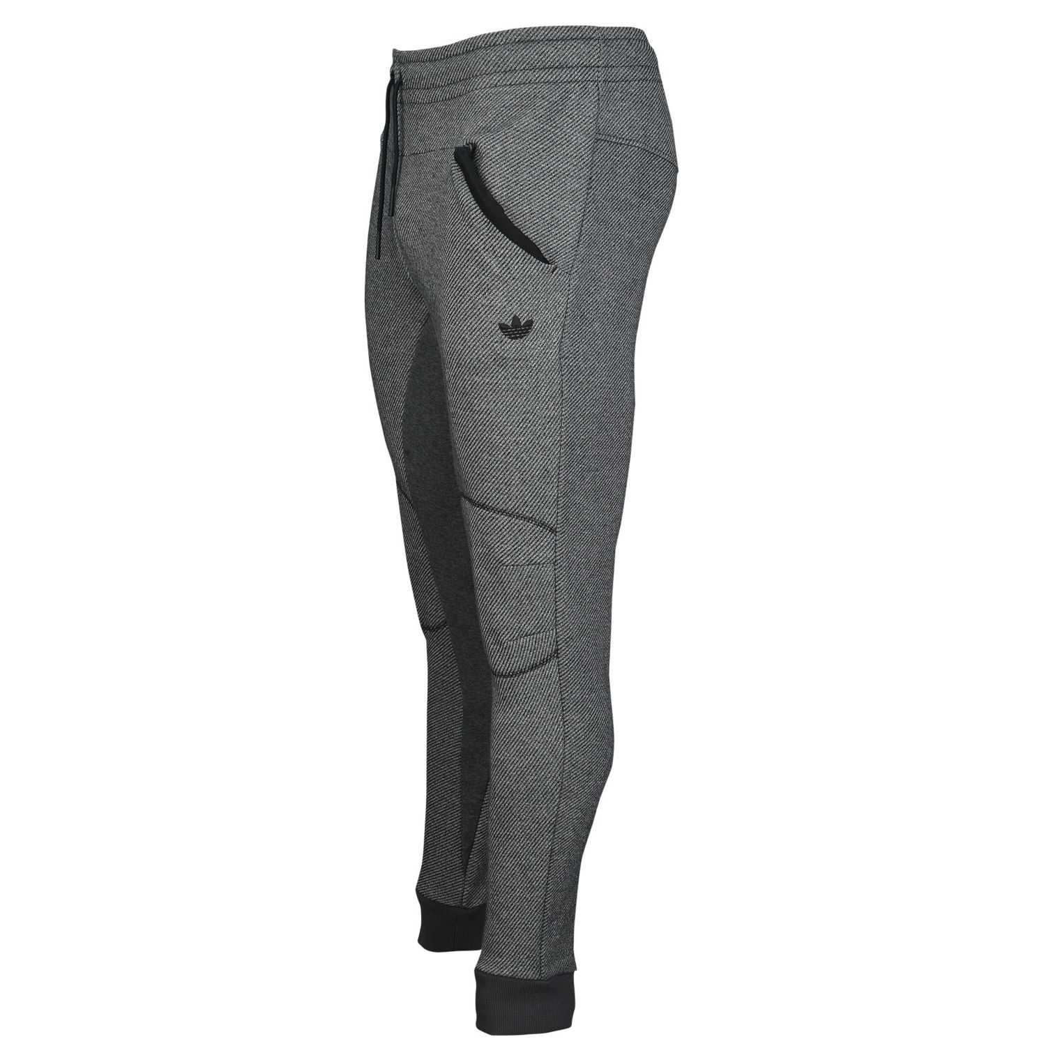
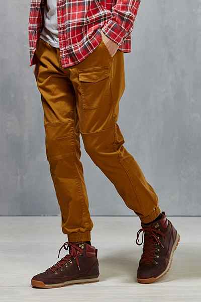
Fall: earth tones with a focus on textures (corduroys, jeans, “waffle shirts”)

Winter: black, white, grey, deep colors. Have the accessories (scarves, beanies, gloves, shoelaces) serve as your flare of color but still no neons or pastels.

Level 2: Don’t go out of your way to be all matchy matchy. What I mean is don’t think, “hmm I have an yellow striped shirt… I should wear a belt with the same exact shade of yellow, yellow earrings, and shoes with the same yellow trim!” Notice I’ve been using the word complement, meaning “goes well with”. Yellow doesn’t go well with yellow (ev28832, WEST HOLLYWOOD, CALIFORNIA - Monday March 2 2009. Paris Hilton glances at new squeeze Doug Reinhardt's butt as the pair head home from Dan Tana's in West Hollywood. The heiress and the professional baseball player have been dating for a few weeks following her split from Benji Madden and his split from Amanda Bynes. Photograph: © Anthony, PacificCoastNews.com ***FEE MUST BE AGREED PRIOR TO USAGE*** UK OFFICE: +44 131 557 7760/7761/7762 US OFFICE: 1 310 261 9676en if its the same shade) if you do it 5 times. Now we are getting into the term color coordinated. Easily, wearing a color coordinated outfit would steer you away from wearing bright neon purple with an earth tone like copper. But at the same time… don’t match too hard by having a bunch of the same color. If you are working with 2 colors… try expanding it to 3 or 4. Here is a website that addresses the issue. Basically just catch yourself and use neutral colors to even things out. If you want to read even further just google matchy matchy or too matchy.

Level 3: The possibly most interesting, possibly least helpful thing ever: undertones. The concept is that everyone has natural coloring and because of this some colors look GREAT on some people while somehow look bad on others. Here is an image I downright stole off the internet. The guy with the pink hand has cool undertones while the yellowish one has warm undertones. (Those are the main two and sometimes “olive” is introduced but we’ll ignore that for now.) When you think of cool undertones think of being in a cave with gems. When you think of warm undertones think of being out in the sun with earthy colors… maybe even in a desert. There are color wheels on the subject but I think those are dumb because you can have a cool orange that looks like the type of color a gem would be, and you can have orange that looks like a warm, earthy dirt clump. Either way, you can still wear orange just a different shade to go along with your skin tone better.

Anyway, this is important when doing make-up in order to be natural looking, but it can be used in fashion too. There are several ways to figuring out your undertone including trying to decipher if your veins are blue or green, if you look best in gold or silver, or if you have a certain eye or hair color. You can google these tests too but I found them unhelpful. Make-up artists and other people versed in fashion take classes on how to figure out others’ undertones. I spoke with a friend who had such knowledge who decided I was both, but mostly “cool”. I do think there is some truth to it. I look awful in some shades of warm colors like yellow, pink, and mustard. I call these my tricky colors. And I think for the most part I do look good in gem colors. But I really don’t do this day to day because it’s limiting. I only think about undertones if I’m going to a wedding or an event like that. I also use this information to avoid buying my “tricky colors” online and wait until I’m in a store so I can see how the color looks against my skin.

I have one last comment on pairing your natural coloring with clothes coloring that I think has a little merit too. When visualizing most outfits, you think of having a little color and anchoring it with some neutral color, to create a nice contrast. Most people like a little contrast. Now with that in mind, pale white people with light colored hair and eyes can “look normal” with wearing more dark colors than a dark black person can, because of the concept of contrast. At the same time dark black people can wear a lot of light colors because their skin naturally adds contrast to the outfit in a way that a pale person’s would not. I hope this makes sense. To put it bluntly and offensively… you can wear a lot of light colors if you are very dark because your skin naturally provides a contrast; while white people would have to wear black accessories or black shoes with this outfit, YOU have your face and your arms so you’re good.

Asians are typically very fair skinned with very dark hair and eyes and are naturally contrasted and look good wearing clothes which also have high contrast like traditional tuxes and suits. Most people are somewhere in the middle and therefore wear regularly contrasted clothes, but just some food for thought.

That’s it. Probably my longest post. I’m sure lots of people can argue every single sentence I’ve written but that is the summary of what I’ve read and what makes sense to me. Feel free to let me know what you think.

Tailored Men’s Shirts #7

This post finally wraps up my series on tips for tailoring men’s shirts. I have one final tailoring trick along with the before and after pictures.

Final trick: The Secret Button

The secret button is a life-saver for many women with breasts > B cups. The idea is men’s shirt typically have buttons spaced further apart and don’t account for boobs. Because of this, the shirts are a little tight on the chest area and causes a little peek-a-boo hole between buttons.

image

The fix can be easily done with a safety pin and I’m going to tell you, I do this. For me, it is worth hurting my fingers and brain for 10 minutes while I figure out how to put the safety pin in to close this gap. Also the language barrier I have with my cheap tailor’s is too significant to introduce this idea. That being said, you might have better luck, as one of my friends did. Basically you put a button on the inside of the shirt in the middle of the gap. Then you put a button hole across from it and it closes the gap secretly. I drew a picture haha due to lack of shirt and my urge to finish this subject.

image

image

image

If that doesn’t make sense… you can say so in a comment and I will just go get one done.

So that’s the last trick I have. Here’s a summary of my tips:

-Tailoring is expensive, but can be worth it. Set a budget and check out sales racks or the thrift store.

– The most expensive part is getting the shoulder taken in so that’s the first thing to look at.

– Secret button prevents peek-a-boo holes

– It’s easiest to tailor shirts if you have wider shoulders than you do hips… so break out those dumb bells! When hemming the bottom, you can ask for a arcs on the sides (sorry not sure what they are called) so that you shirt doesn’t go straight across and tug at your hips. (See below)

image

– Typical alterations include sleeves shortened, hemmed at the bottom, and taken in at the sides. Keep this in mind when you buy it because this might change the design or chop off a logo.

image

image

image

image

Men’s Tailored Shirts #6

The shoulders were a little long on this shirt so I had them taken in an inch (most places won’t let you take it in too much more). That is the only thing I had done. The sleeves’ starting point was already a little above my elbow so I figured an inch would be good enough.

Before

image

image

After

You can see the sleeve is now a little higher up the elbow. I like my sleeves a little shorter still so I could take this back in again, and probably will. I posted this anyway even though it’s not the finished project, just so you all could see the effect of this action alone.

image

image

And a side by side comparison since the change is not very dramatic:

image

I still think, even though it’s barely noticable, that the shirt looks sharper when the shoulder is where it should be. Showing off your arms a little can be good and having the sleeve come up a little is a good way to do that.

I’ll write a summary post on this series, then I’ll write a little about choosing colors!